11fold / 2025
A clearer chart.
A better conversation.
Turning a consultant-led bubble chart into a connected workflow for teams to prepare, share their input, and discuss their work.
- Role
- Product designer, Project manager
- Timeline
- Jan 2025–Jun 2025
- Team
- 4-person UW team, 4-person 11fold team
- Tools
- Figma, FigJam, Trello
01 / Context
A useful conversation tool with a difficult process behind it.
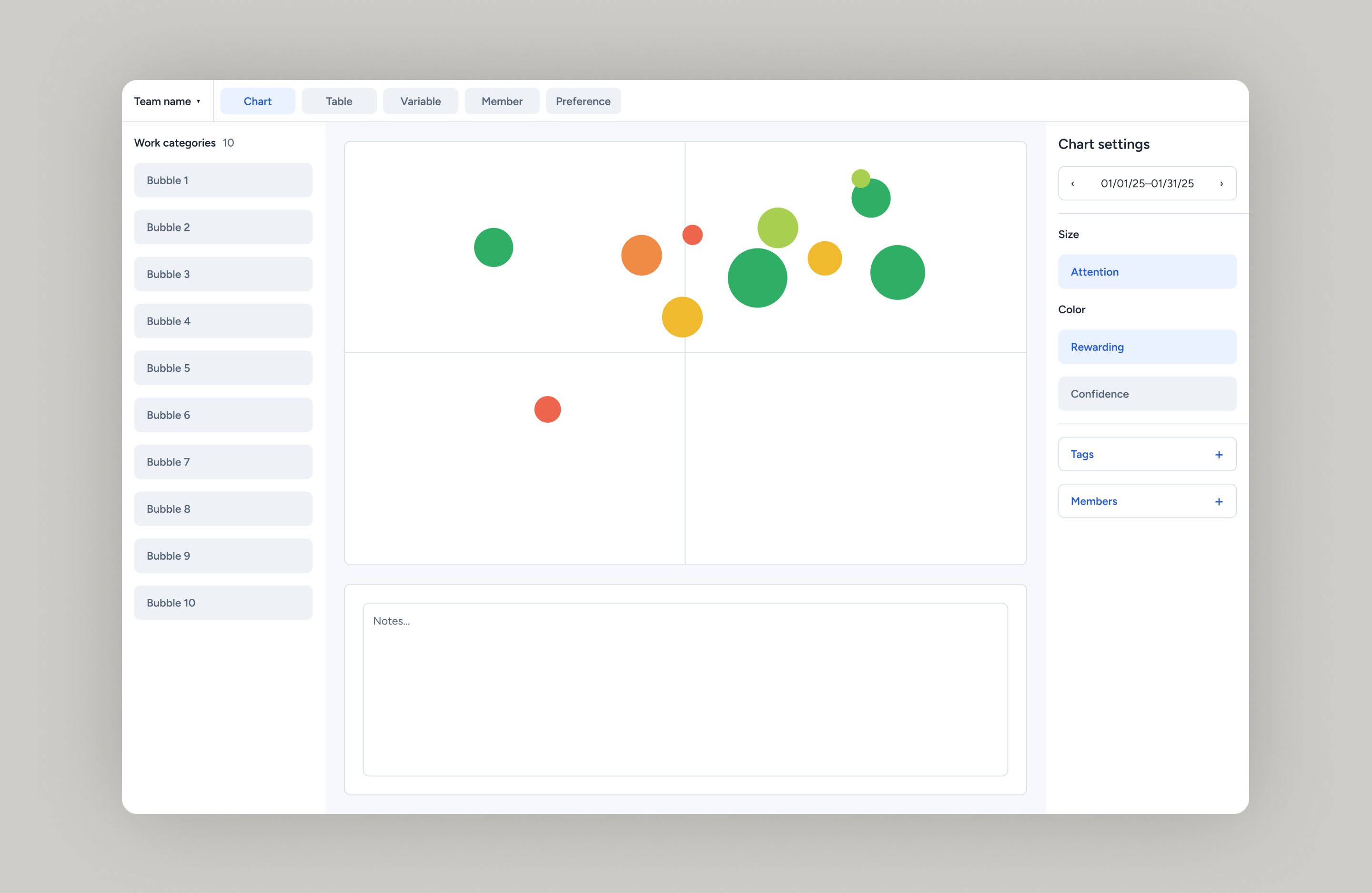
11fold helps teams talk about how they experience their work. Each bubble represents a project or work category. Its position can show how that work fits the team’s strengths and mission, while its size and color describe measures such as attention and how rewarding the work feels.
The chart gave people something concrete to discuss, but preparing and using it relied on spreadsheets and an experienced facilitator. Our initial brief focused on improving interaction with the chart. Research led us to look at the whole process, including the work people did before a meeting began.
My contribution
I led an eight-person team, directed five user research sessions, and synthesized qualitative findings into personas and journey maps. I managed the project’s workflow in Trello and used MoSCoW prioritization to shape the product roadmap and handoff.
As a product designer, I created a design system for the redesign and designed the chart view for exploring selected data. The research and end-to-end workflows shown here reflect our team’s shared work.
02 / Research
The meeting was only one part of the problem
We observed monthly reviews, interviewed users, and used the chart within our own capstone team. This let us examine both the discussion and the preparation behind it. Our team conducted seven interviews across two client teams. I directed five research sessions.
Observe the conversation
We observed consultant-led monthly reviews to understand how the tool supported live discussion. Those observations shaped our interview questions.
Hear both sides
One-hour Zoom interviews explored what clients found useful, frustrating, or unclear. With recording consent, transcripts supported thematic analysis.
Become the users
We used the bubble chart within our capstone team, experiencing onboarding and recurring reviews firsthand and discussing friction with our sponsor.
From observations to opportunity areas
Setup
Make configuration and shared definitions part of the experience.
Input
Connect each rating to the work and meaning behind it.
In-meeting review
Help the team focus, compare, and discuss what the chart reveals.
Affinity analysis in FigJam helped us group observations into themes and identify these three areas for design.
| What we learned | What it meant for the design |
|---|---|
| Facilitators held a fragmented process together. | Bring setup, input, and review into a connected application. |
| Definitions felt separate from the metrics people were rating. | Show definitions and work context at the point of input. |
| Teams lacked useful controls for exploring the chart. | Support focused views, filtering, and comparison across months. |
| Teams used the chart in very different ways. | Make metrics and workflows configurable while retaining a coherent experience. |
| Input felt dull and disconnected from reflection. | Make changes visible as people enter ratings and allocate attention. |
Research affinity map
The research synthesis connects the observations behind our three priorities: setup, individual input, and team review.
03 / Direction
Design the workflow before refining the screens
The findings pointed to three connected tasks: define what the team is measuring, collect each person’s input, and review the results together. Improving the chart alone would leave the first two tasks fragmented. We therefore expanded the design to support both team members and the person running the meeting.
Our sponsor welcomed the focus on administration, an area he said he had not previously considered. That gave us a clear direction: help teams prepare and run their own reviews with less dependence on a consultant.
We mapped the facilitator and team-member journeys before building the early prototypes. The maps helped us identify missing steps and divide the design work across the team. They also established how individual responses would feed into the shared chart.
Two roles. A connected experience
Our sitemaps separated each role’s responsibilities while connecting preparation, contribution, and review.
Facilitator
- Set up the teamConfigure metrics and operational definitions.
- Coordinate inputManage members and check submission status.
- Guide the reviewExplore the chart and support the discussion.
Team member
- Reflect on the workReview categories and the team’s definitions.
- Contribute inputPlace bubbles and rate the selected metrics.
- Review togetherUse the visualization as a shared basis for conversation.
Ideation and brainstorming
The ideation board captures the ideas considered as we expanded the brief from chart interaction to the process around it.
Sitemap
The sitemap connects the facilitator and team-member paths. It provides the structure for the early screens that follow.
04 / Lo-fi prototyping
Work out the tasks before the visual details
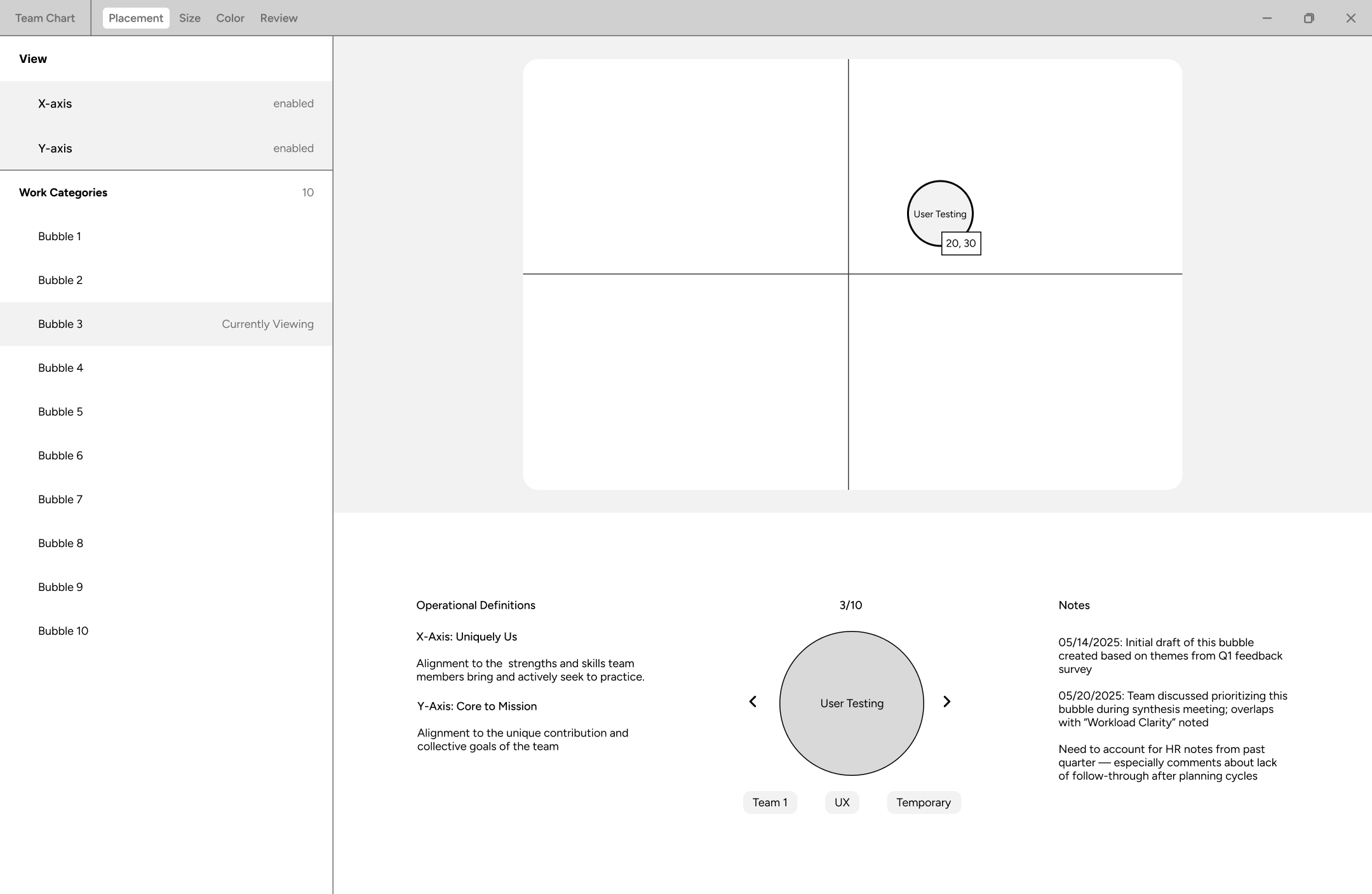
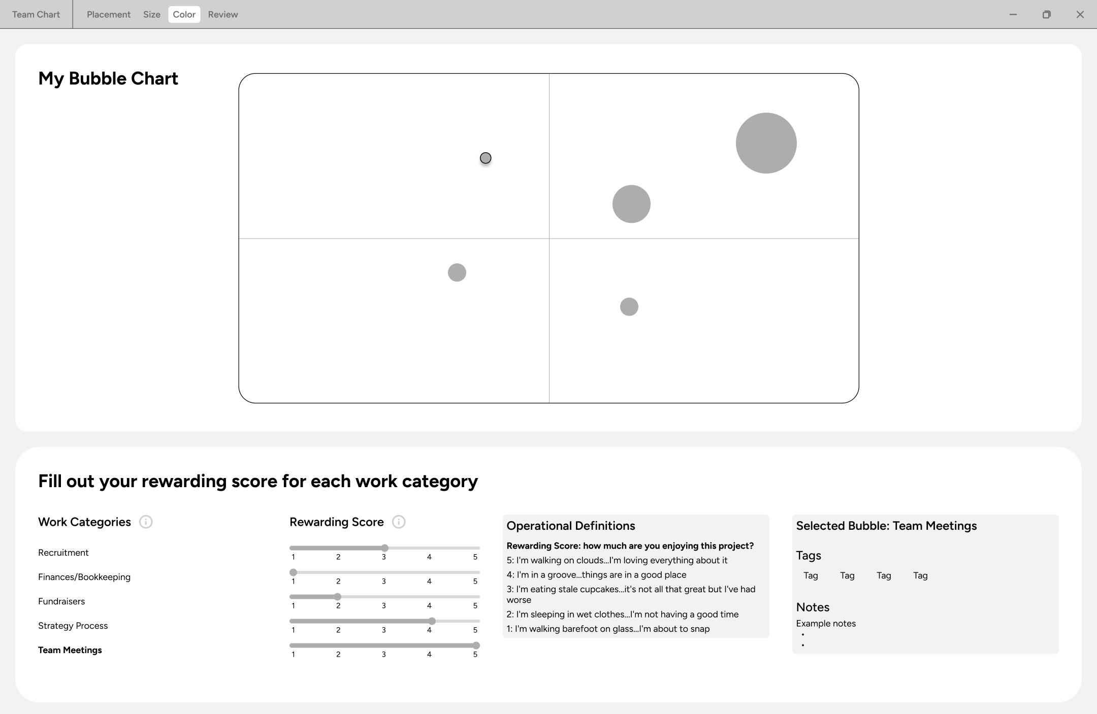
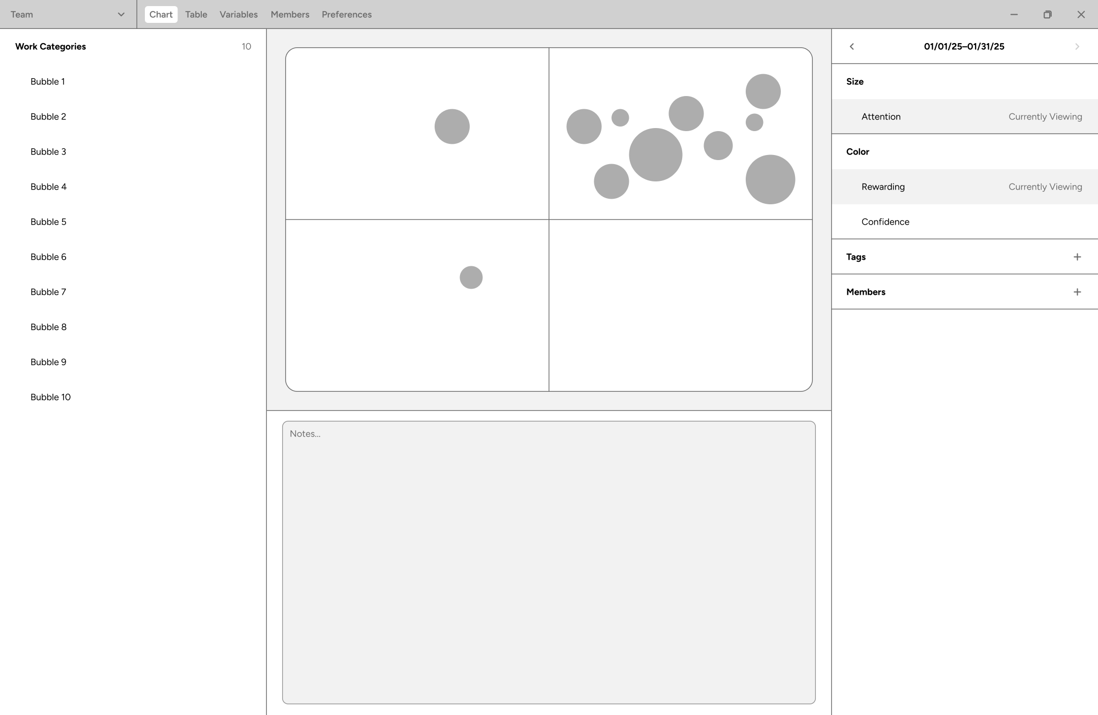
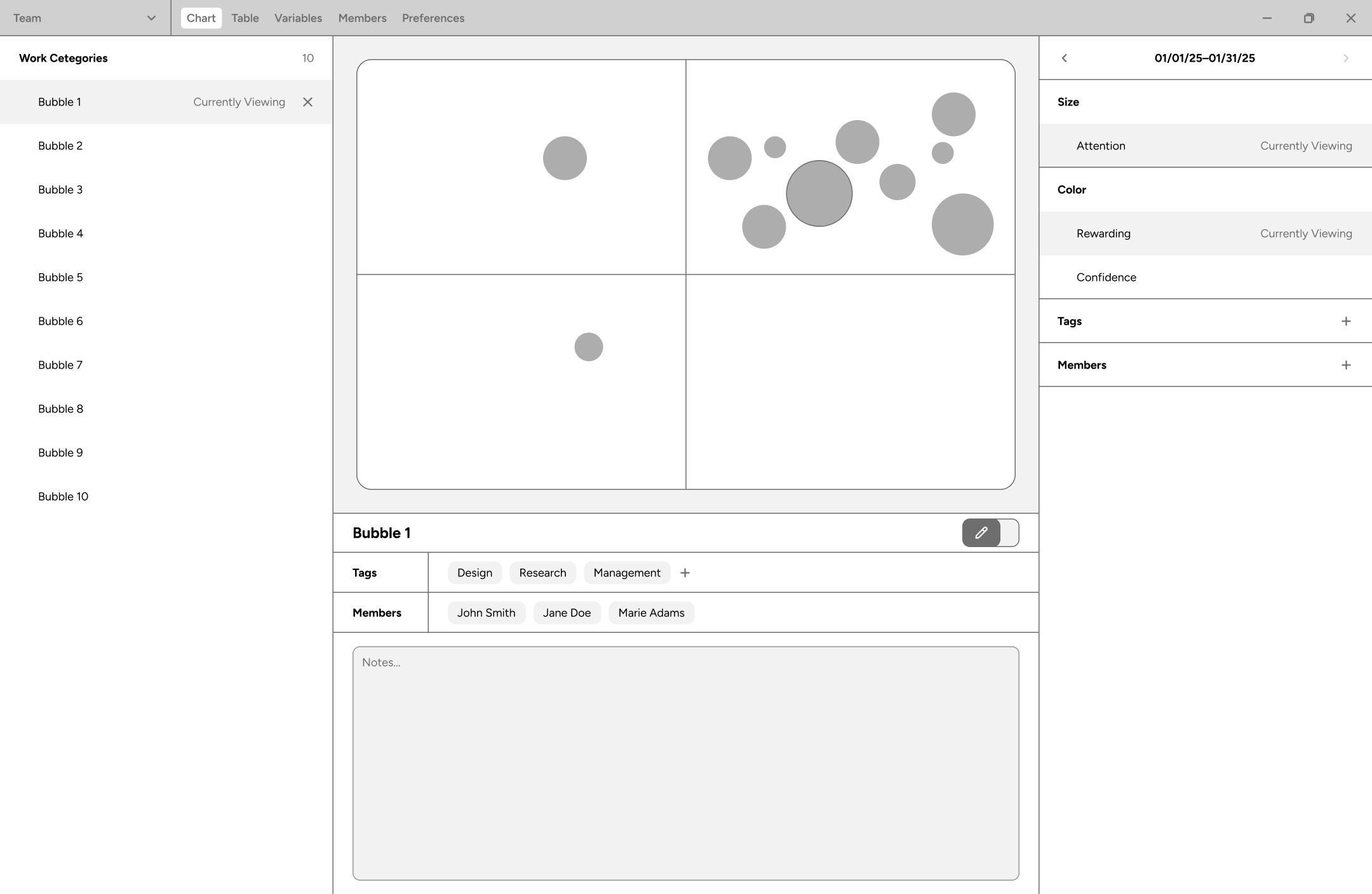
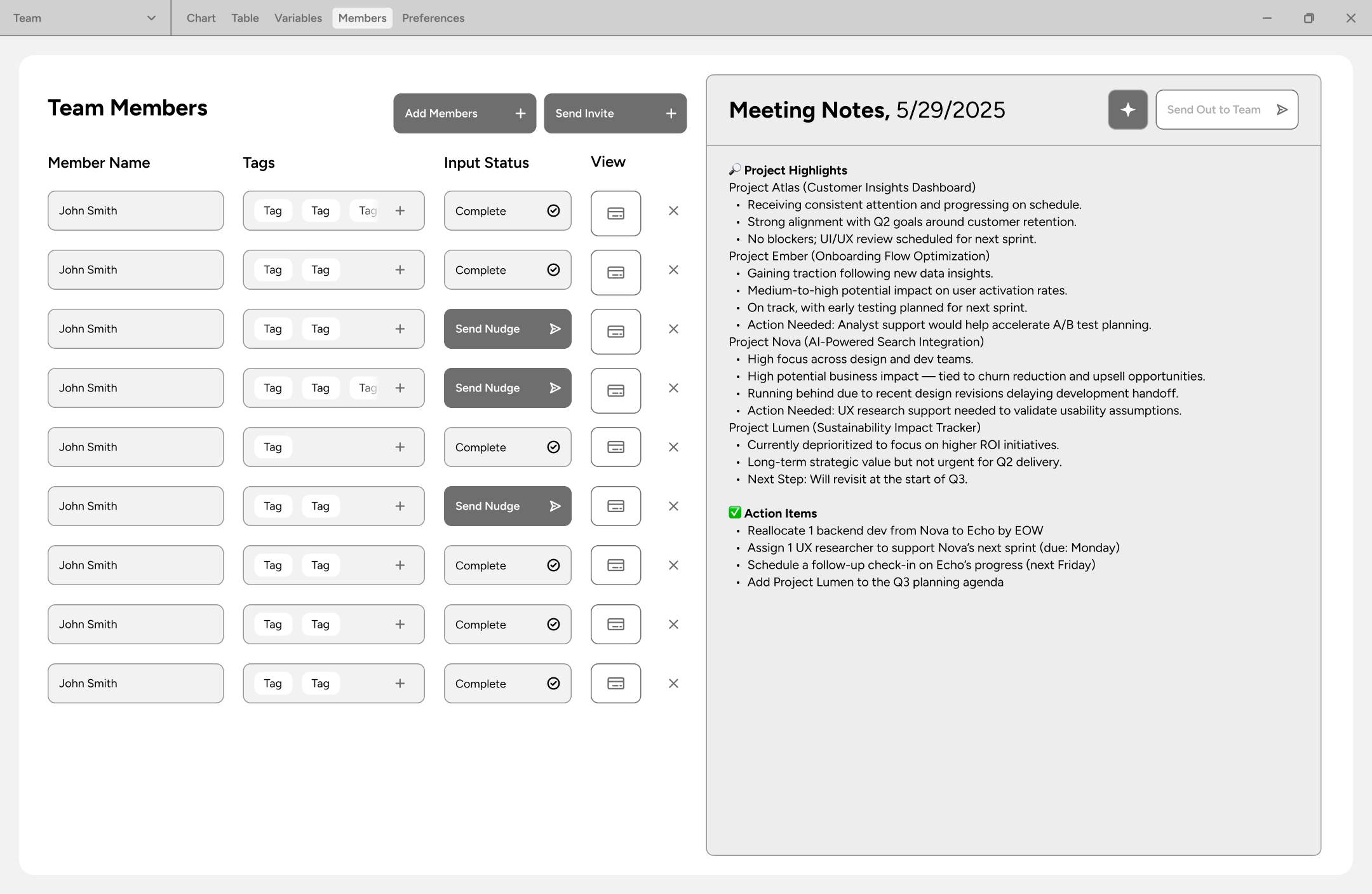
The grayscale prototypes served as our lo-fi stage. They brought the sitemap into screens so we could work through navigation and decide where people would find definitions, enter responses, and review the chart.
The input screens establish the member’s sequence. The facilitator screens then bring those responses into a shared workspace, with context for the meeting kept close to the chart.
Placement
Color
Review
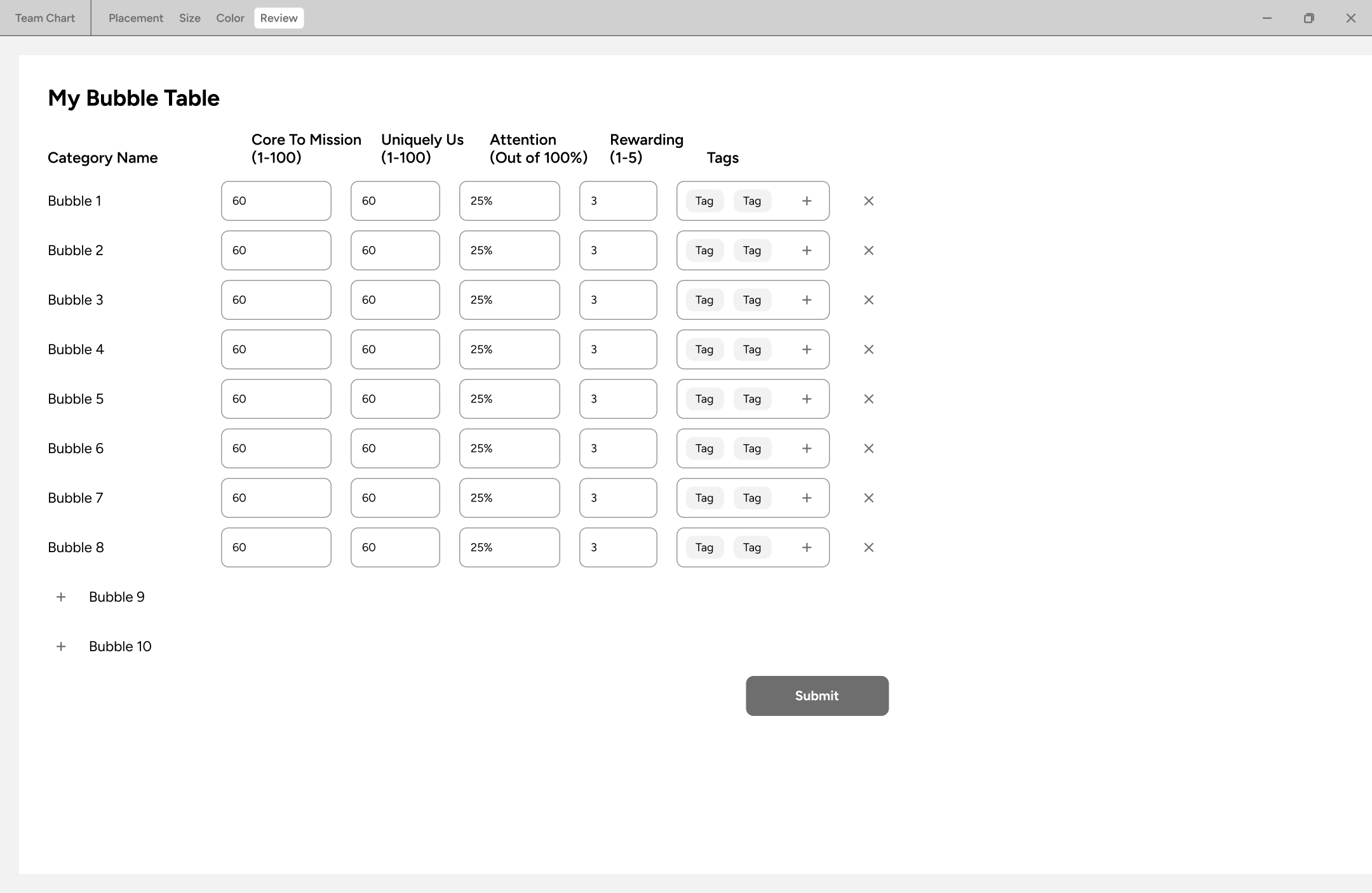
Chart overview
Bubble details
Team members
05 / Hi-fi prototyping
Make the established workflow easier to read and use
With the workflow established, the hi-fi designs focus on how people understand each task: the instructions they read, the controls they use, and the feedback they receive.
The hi-fi designs keep the core workflow while refining the hierarchy, spacing, instructions, and controls. The screens below follow the same sequence as the wireframes, showing the changes in context.
Design decision / Team input
Help people understand the rating they are giving
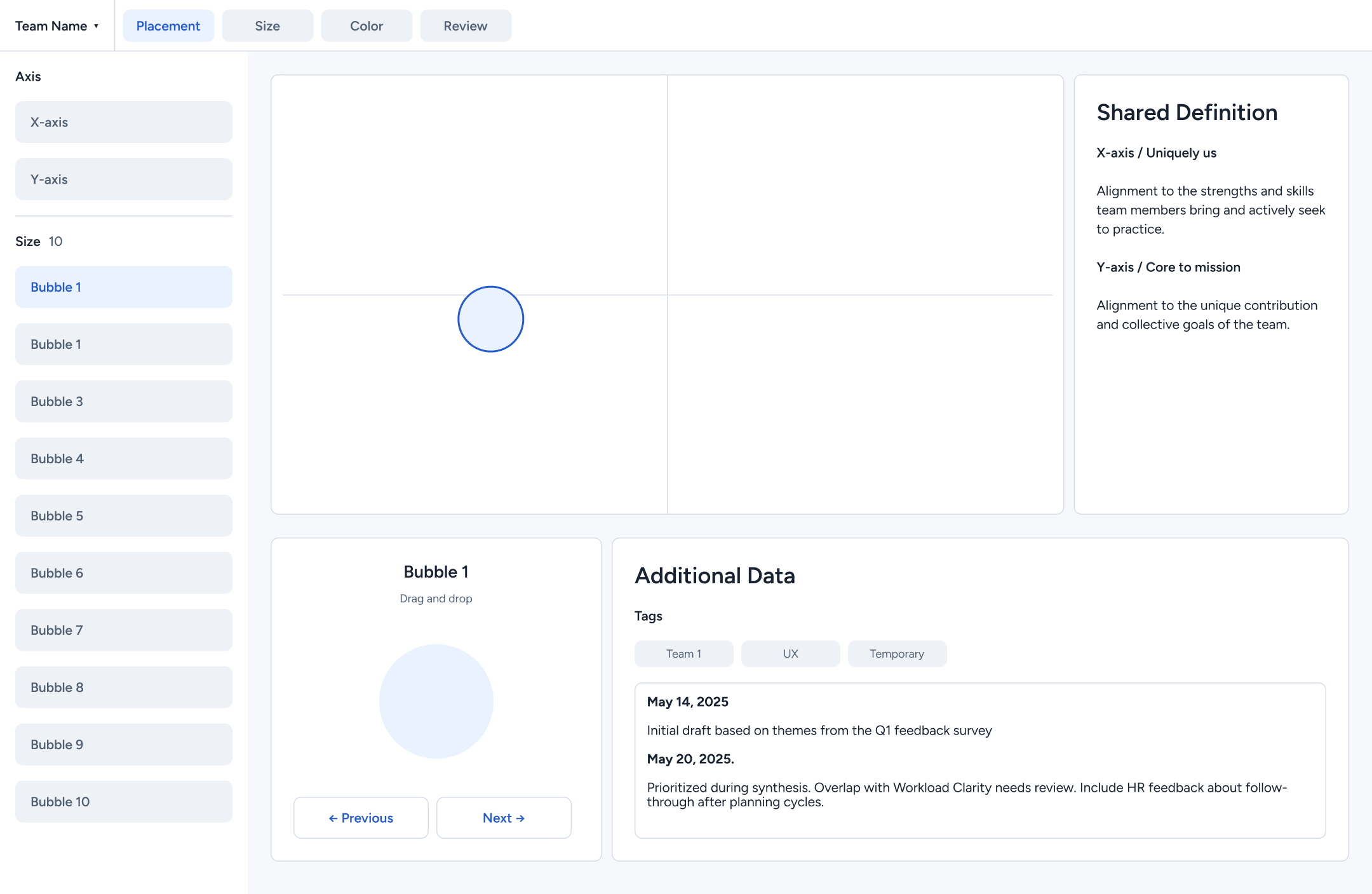
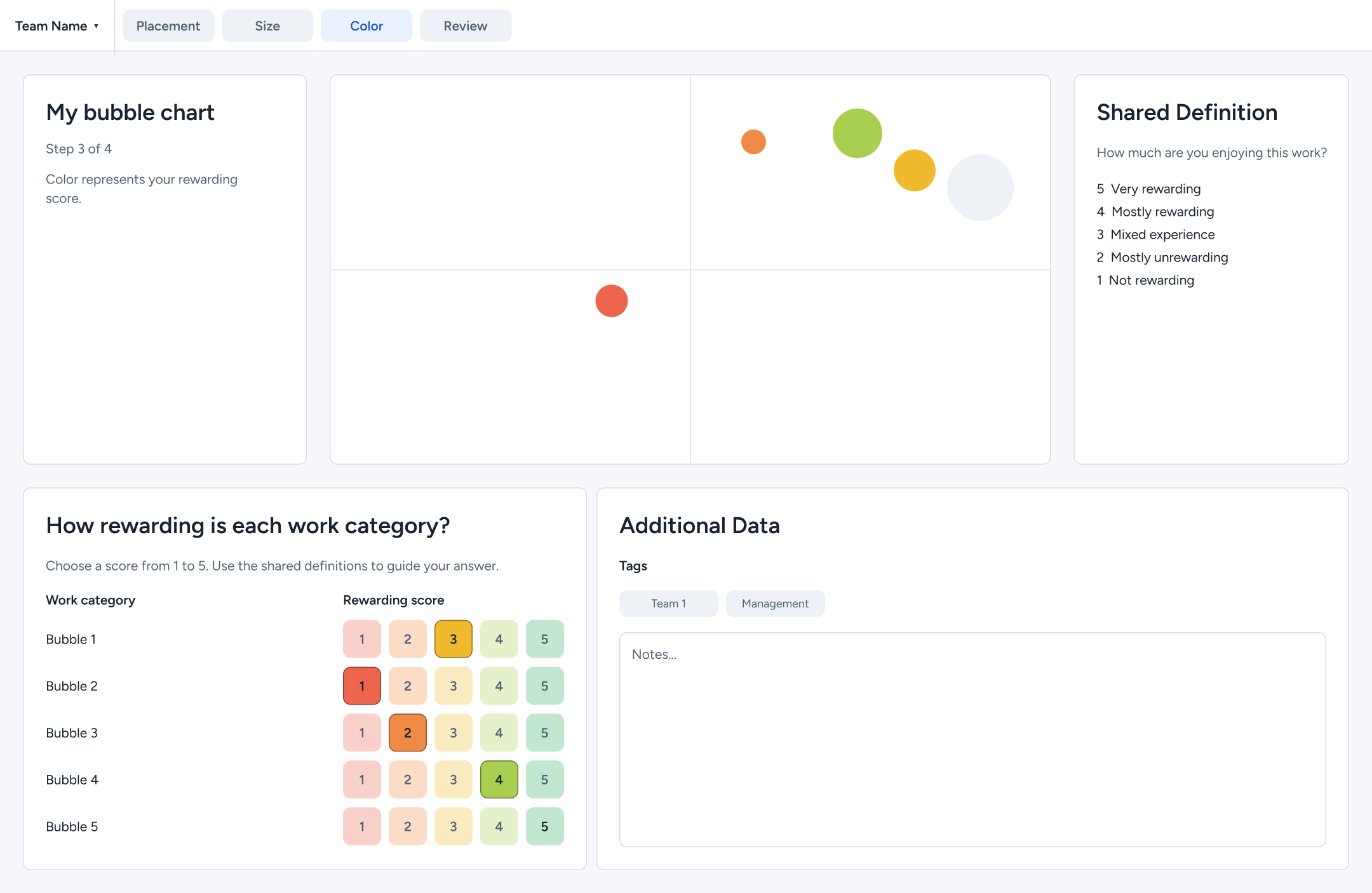
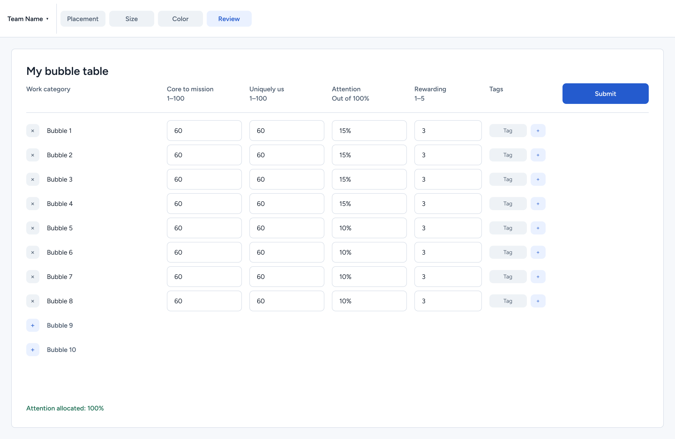
Research showed that definitions felt separate from the measures people were rating. The early input flow brought placement, size, color, and review into a guided sequence, with definitions and notes available alongside the task.
In the hi-fi placement screen, the shared definitions move beside the chart where they are easier to reference. In the color step, sliders become explicit choices from one to five, paired with color and written descriptions. These changes aim to make the meaning of each response clearer.
We kept the review table because people also need to check their answers together. The hi-fi version retains that familiar structure and makes the total attention allocation visible before submission.
Placement
Color
Review
Design decision / Facilitator review
Keep the chart and the context for discussion together
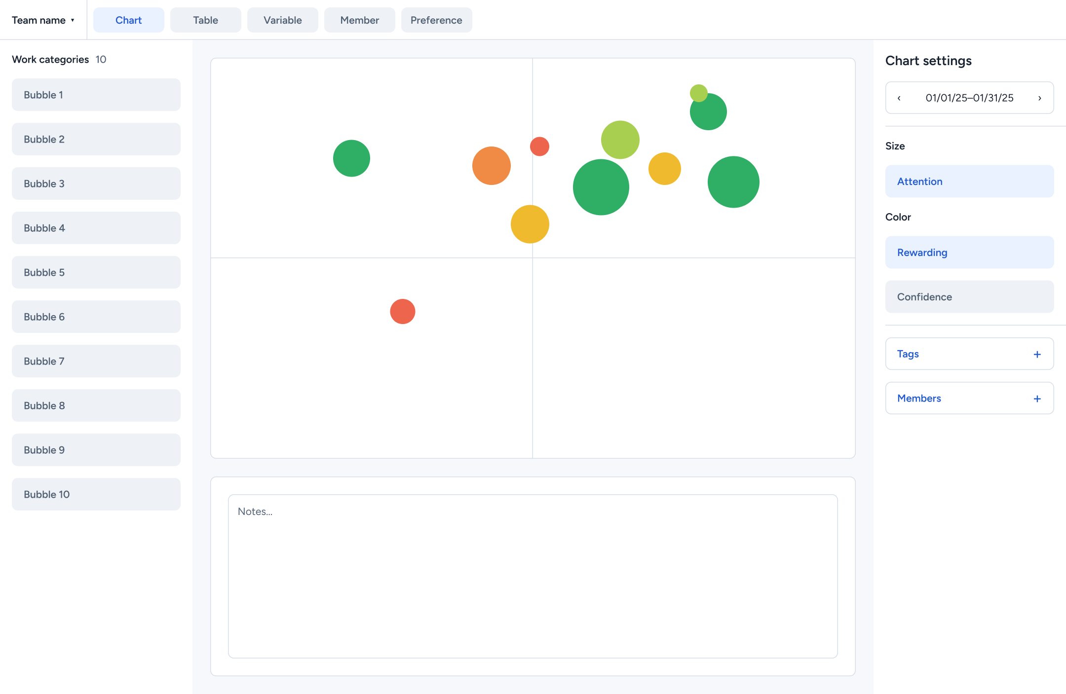
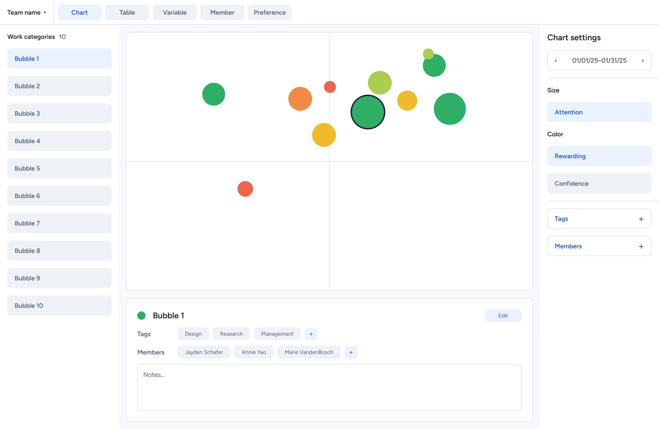
Facilitators were holding a fragmented process together. The early review screens therefore placed work categories, chart settings, and notes around one shared chart. Selecting a bubble revealed its tags and members below, giving the facilitator context without leaving the discussion.
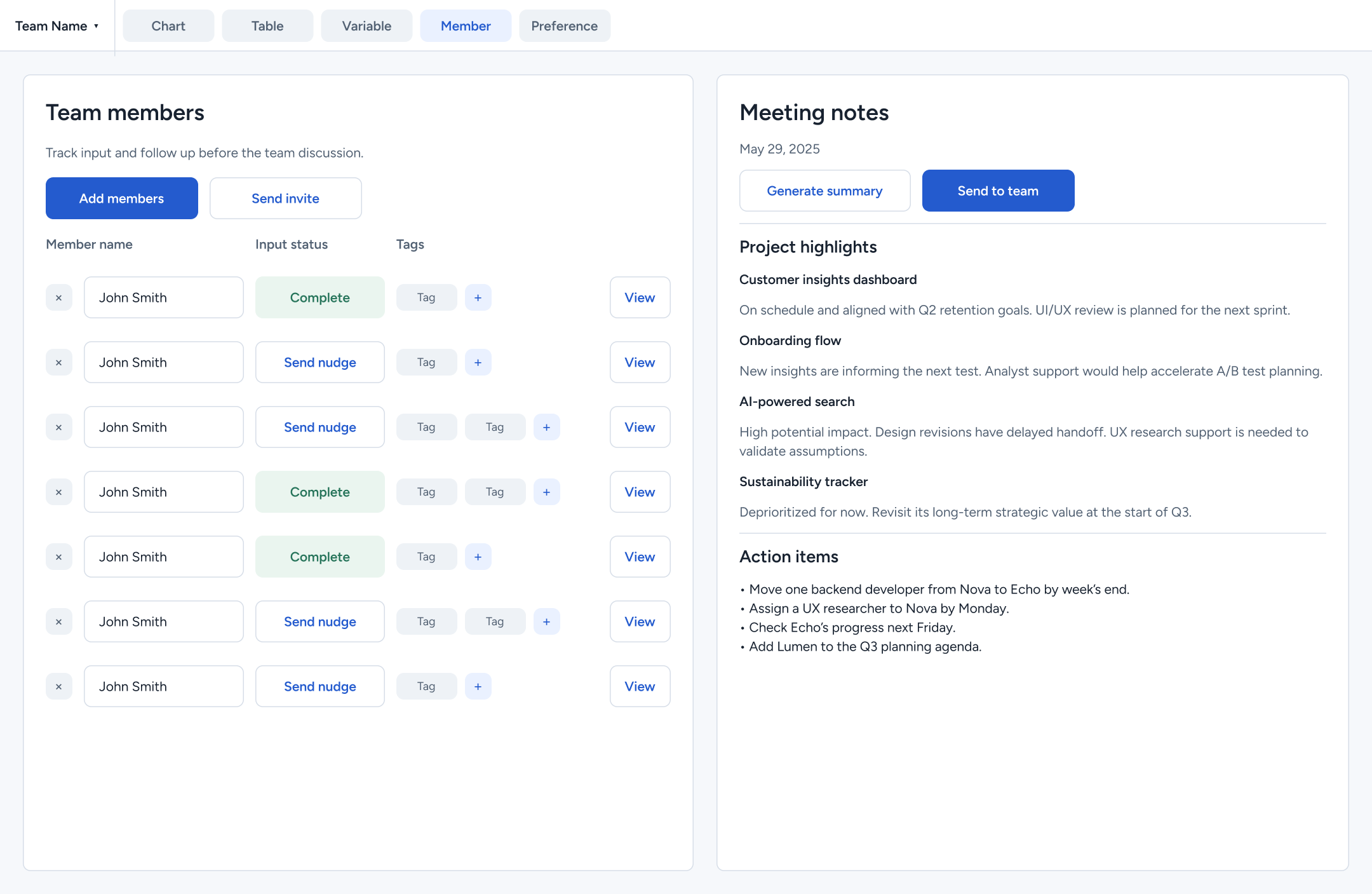
The hi-fi version keeps that arrangement. Stronger selection states, clearer control groups, and color-coded bubbles help distinguish what is selected and what can be changed. The member view also separates completed input from responses that need a follow-up, with meeting notes alongside.
My chart-view work focused on showing selected data clearly. The broader workflow was a team effort, including member management and the meeting-summary concept shown in the prototype.
Chart overview
Bubble details
Team members
06 / Feedback
Feedback supported the workflow and exposed what still needed work
We walked 11fold through the facilitator prototype and gathered client feedback. The ability to customize the tool was well received, but some terminology and instructions needed clarification. One client also wanted to reuse the previous cycle’s responses instead of starting from scratch.
The feedback reinforced two priorities: explain the task in language people understand, and reduce the effort of returning each month. The visual refinement shown above makes instructions and controls more prominent. Reusing previous responses remains a feature to develop and evaluate.
What we delivered
The project produced a product roadmap and Figma prototypes for a connected setup, input, and review experience. The early wireframes established the structure. The hi-fi designs developed that structure into clearer screens with consistent controls and visual feedback.
The result is a completed design prototype. We have not measured whether it reduces preparation time or makes meetings easier to facilitate. Those are the next questions to test with teams.
Next steps
- Integrate Tableau dashboards to make the prototype more complete and support developer handoff.
- Conduct further usability and accessibility testing.
- Evaluate technical feasibility and incorporate it into the recommendations.
- Package the design system and interaction guidance for the software team.