Terragone / 2025
A changing planet.
A personal perspective.
Exploring how a mobile experience can connect everyday choices with climate information—and make change over time easier to understand.
- Role
- UI designer, Visual designer
- Timeline
- 2 days
- Team
- 5 people
- Tools
- Figma
01 / Context
Make a large, abstract problem easier to relate to
Terragone began with a communication challenge: it can be difficult to connect daily decisions with environmental change across long periods of time. The project framed three barriers—limited awareness of personal carbon impact, difficulty visualizing future conditions, and a sense of distance from the issue.
The design question was how to visualize climate change across time in a way that feels relevant to an individual. The proposed experience combines a personal footprint questionnaire with visual explorations of environmental conditions.
02 / Research
Awareness was mostly approximate
The project combined a participant survey with secondary research. Among 33 respondents, most described only a rough understanding of their carbon footprint.
Self-reported carbon footprint awareness / n = 33
No idea or never tracked
Little visibility into their individual footprint.
A rough idea
Some awareness, without a precise estimate.
A very accurate estimate
A small share reported detailed awareness.
These are self-reported responses from this survey, not a test of calculation accuracy or a population-wide estimate.
Beyond the numbers
One participant asked for plain-language explanations, clearer connections to communities and ecosystems, and practical ways to respond. This added a communication need alongside the awareness gap: the information needed to be understandable and relevant.
Secondary research drew on climate and environmental resources, including EPA, NOAA, and Wisconsin DNR materials. It informed the concept’s subject matter: air pollution, sea-level change, and temperature.
03 / Direction
Connect the personal to the planetary
The persona, Veronica, represents a young adult who cares about the environment but struggles to connect daily choices to climate outcomes. Her journey provides a through-line for the prototype: discover a footprint, explore its context, and move through time.
| Research or framing | Design response |
|---|---|
| Most survey respondents reported approximate or limited footprint awareness. | Begin with a short questionnaire about everyday choices. |
| The persona struggles to connect those choices with environmental outcomes. | Follow the questionnaire with an illustrated impact experience. |
| The brief identified difficulty visualizing change over time. | Let people explore environmental conditions across past, present, and future views. |
04 / Lo-fi prototyping
Establish the journey from choices to climate information
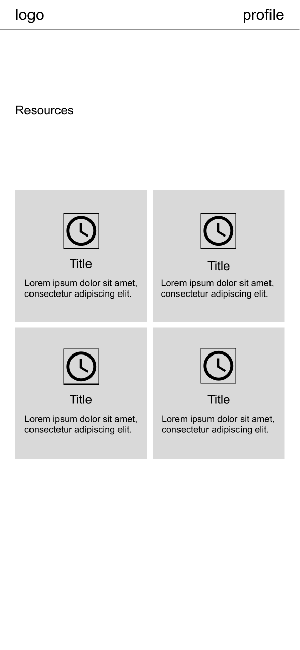
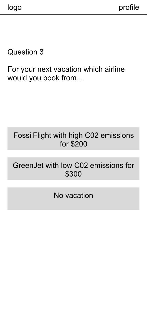
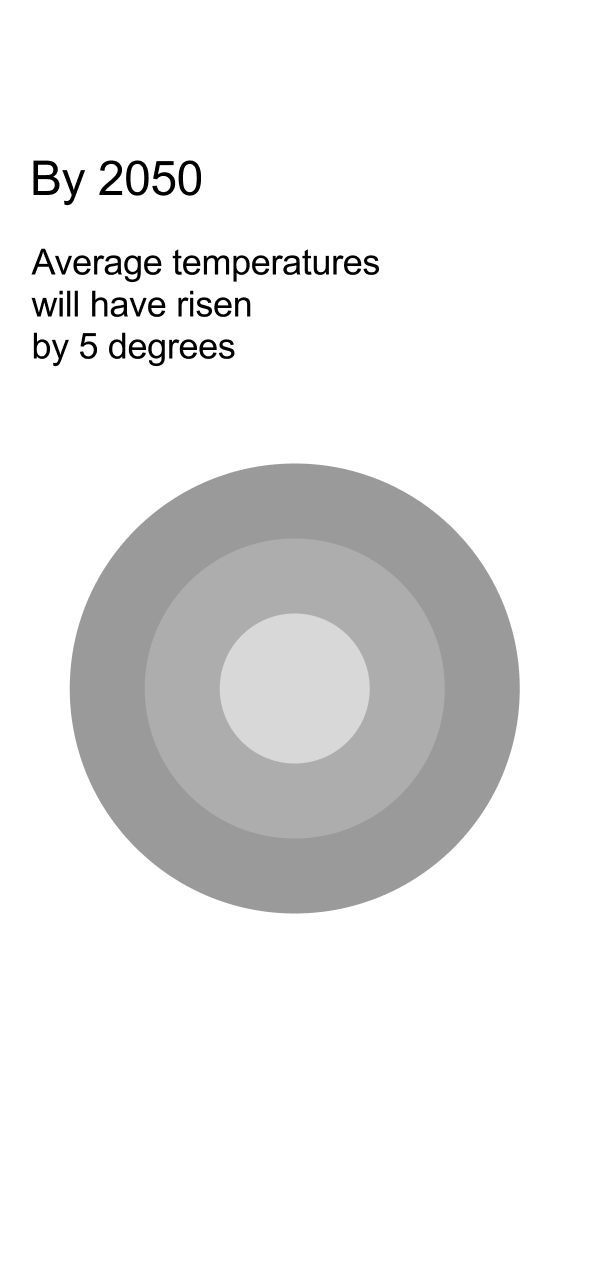
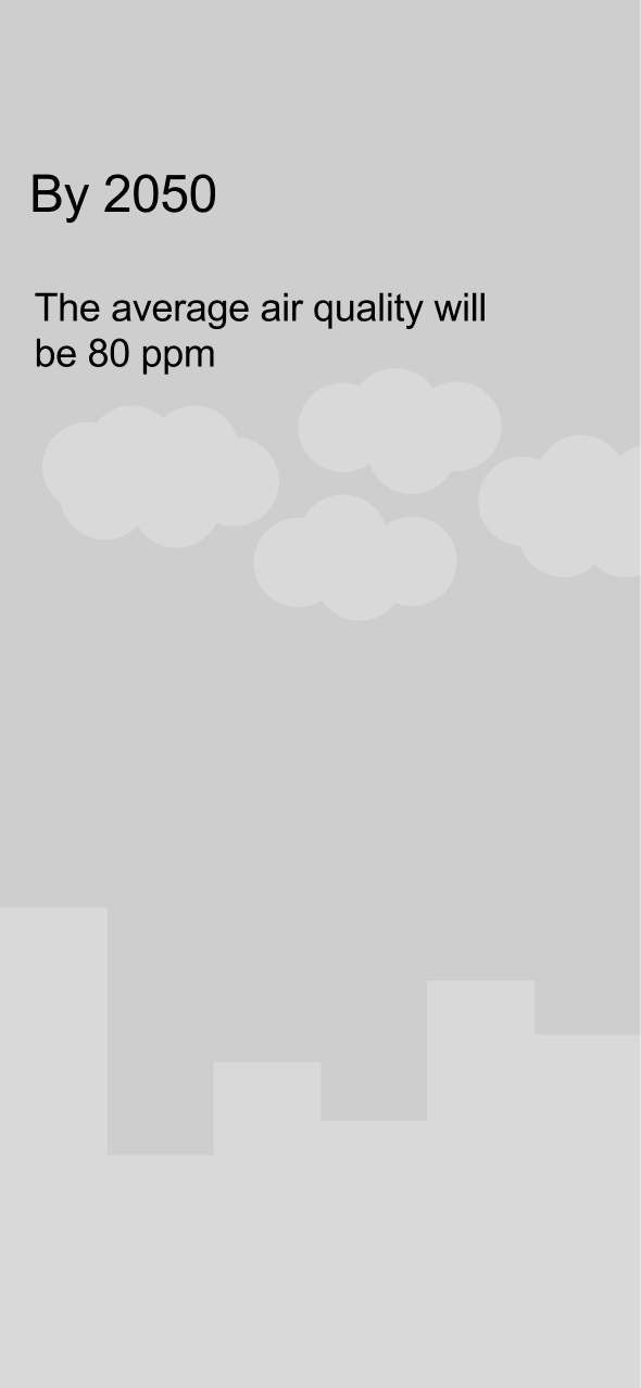
We started with lo-fi wireframes to connect three steps: answering questions about everyday habits, seeing a visual response, and exploring climate conditions over time. This sequence became the foundation for the hi-fi prototype.
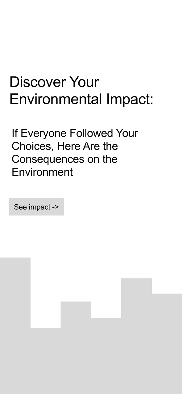
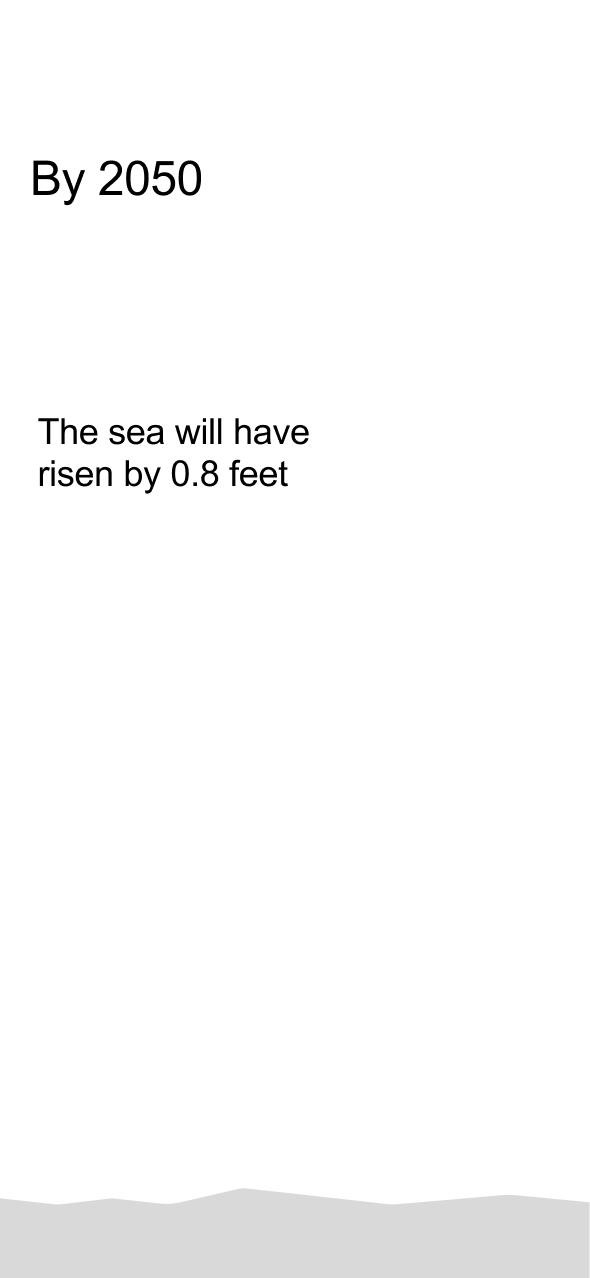
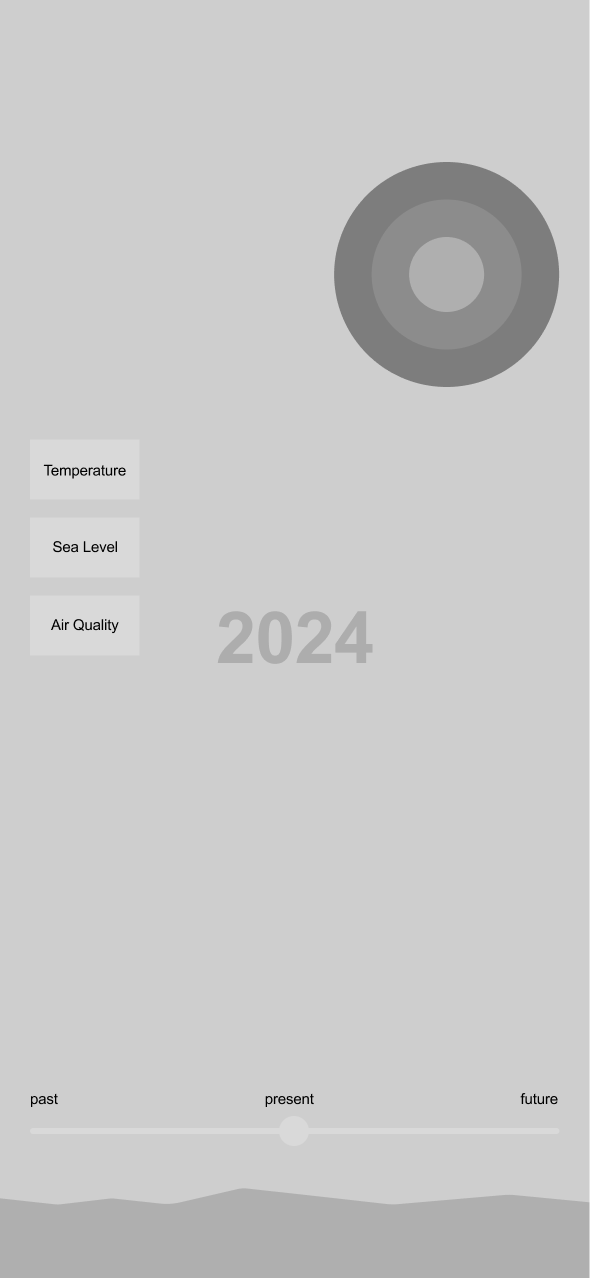
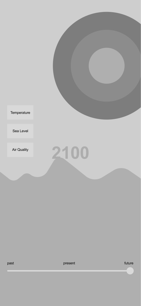
The wireframes map the questionnaire, the transition into an impact scenario, and the controls for exploring environmental change before adding the visual identity.
Dashboard and resources
Local climate dashboard
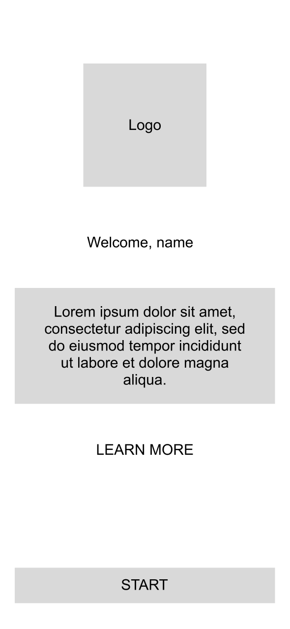
Supporting resources
Three questions
Transportation
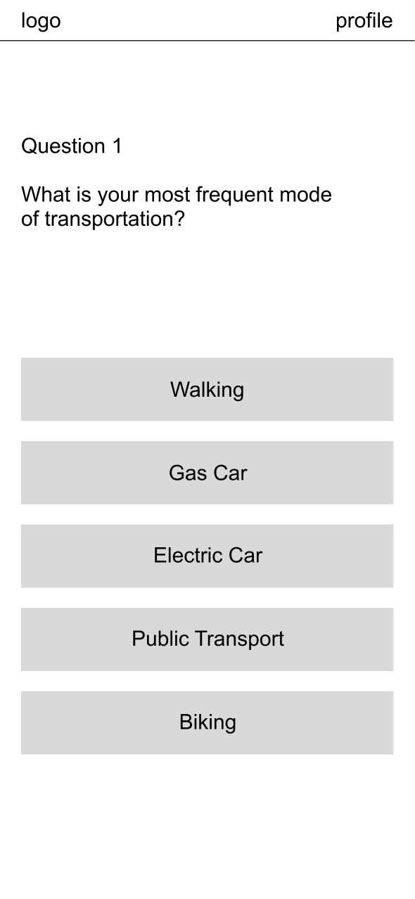
Policy preferences
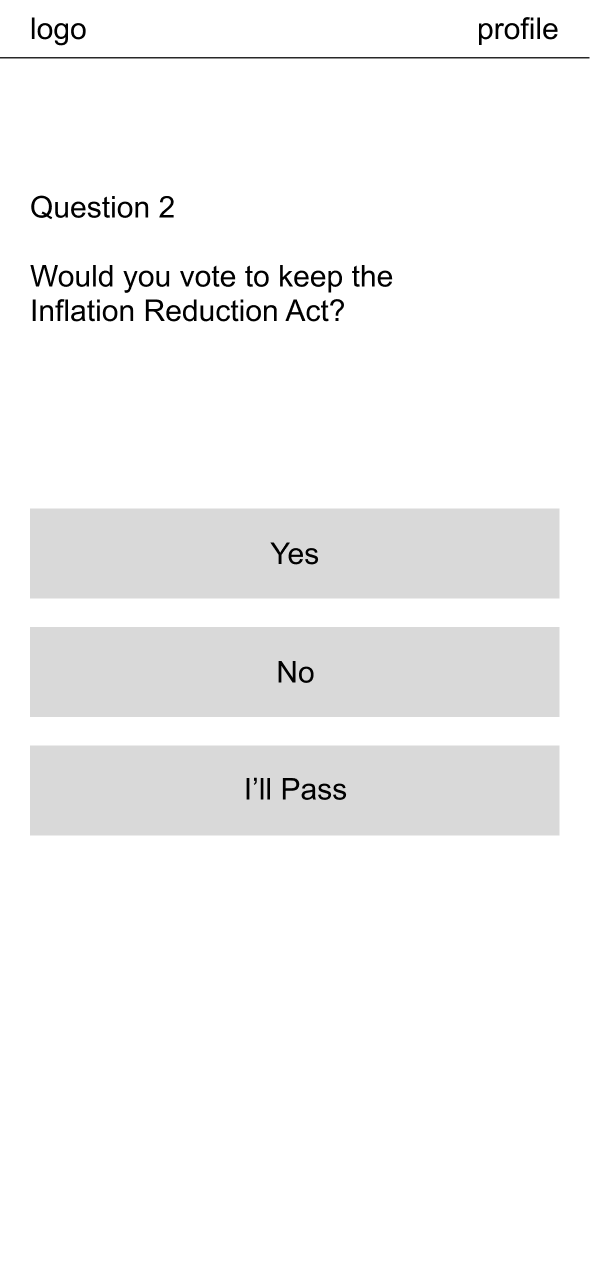
Flight choices
Loading the results
Results loading screen
Environmental views
Sea level
Temperature
Air quality
Time exploration
Present view
Future view
05 / Hi-fi prototyping
Use illustration to make each step more approachable
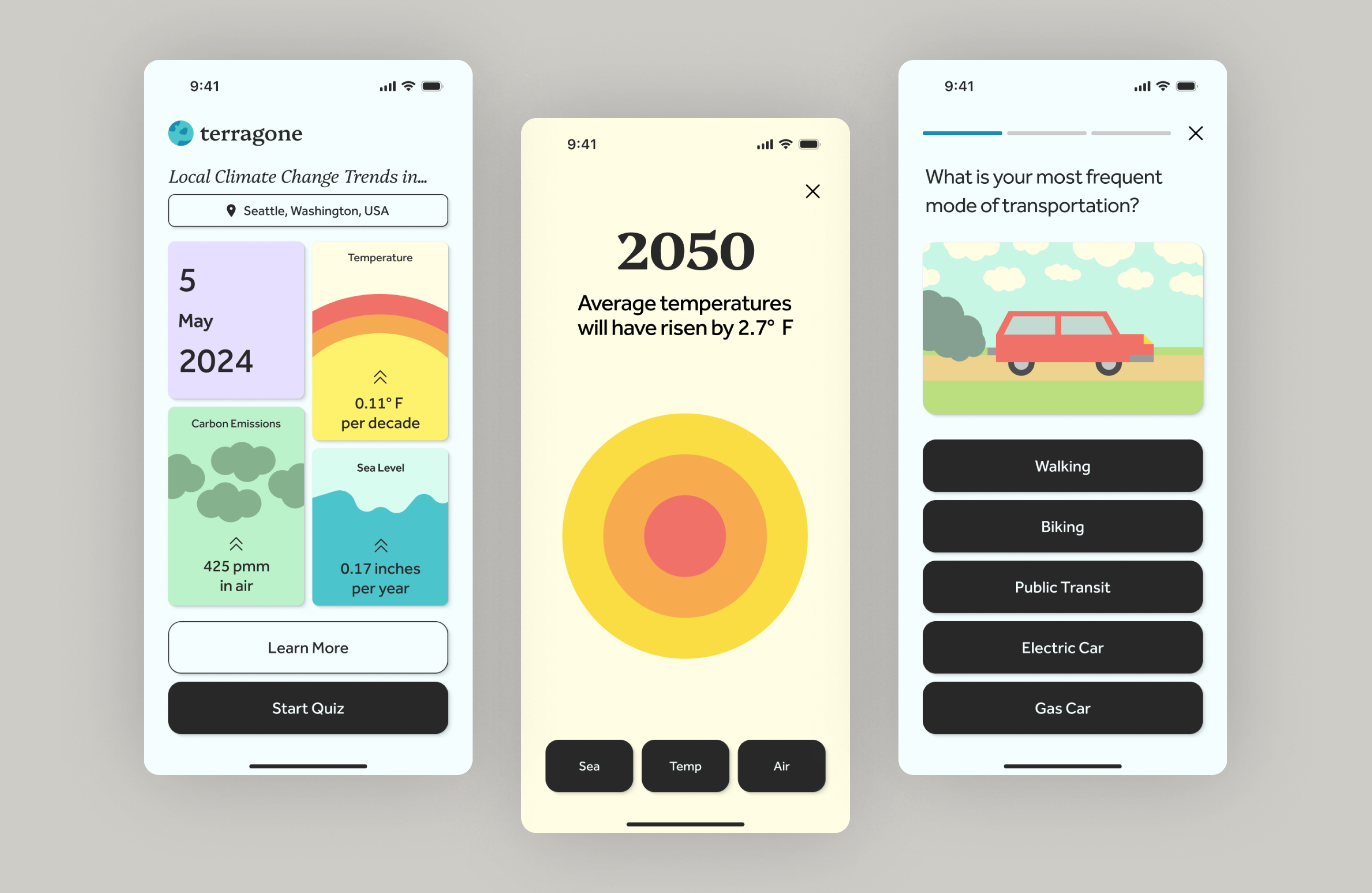
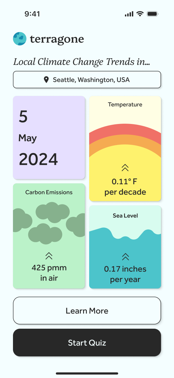
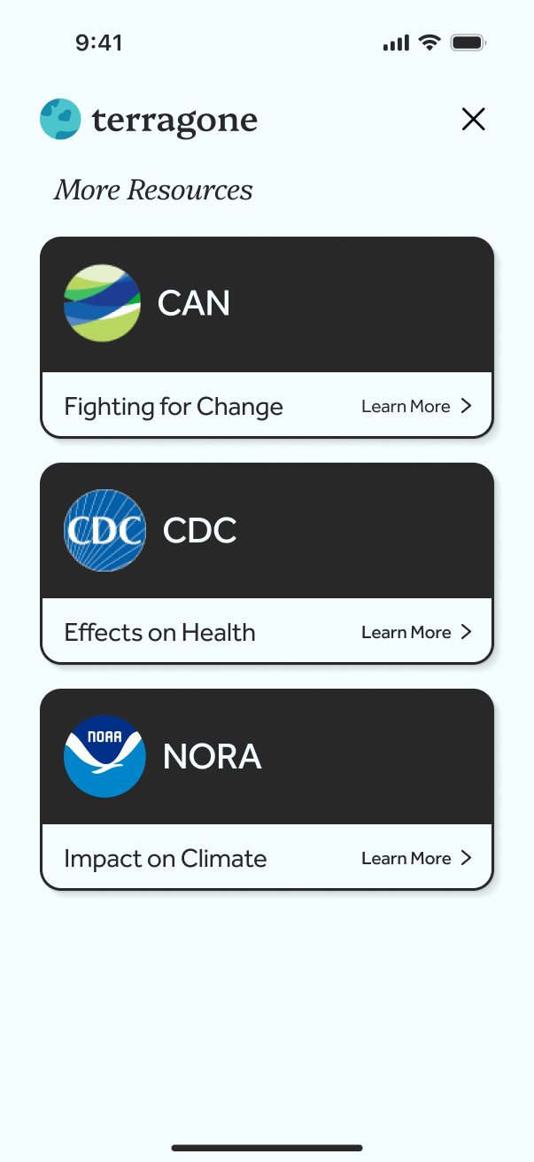
The hi-fi prototype adds a consistent visual identity, illustrated questions, and distinct environmental views to the flow established in the wireframes. The screens below follow the experience from answering questions to exploring the scenario.
Welcome
Brand introduction
Welcome transition

Welcome back
Dashboard and resources
Local climate dashboard
Supporting resources
Feature / questionnaire
Discover your footprint
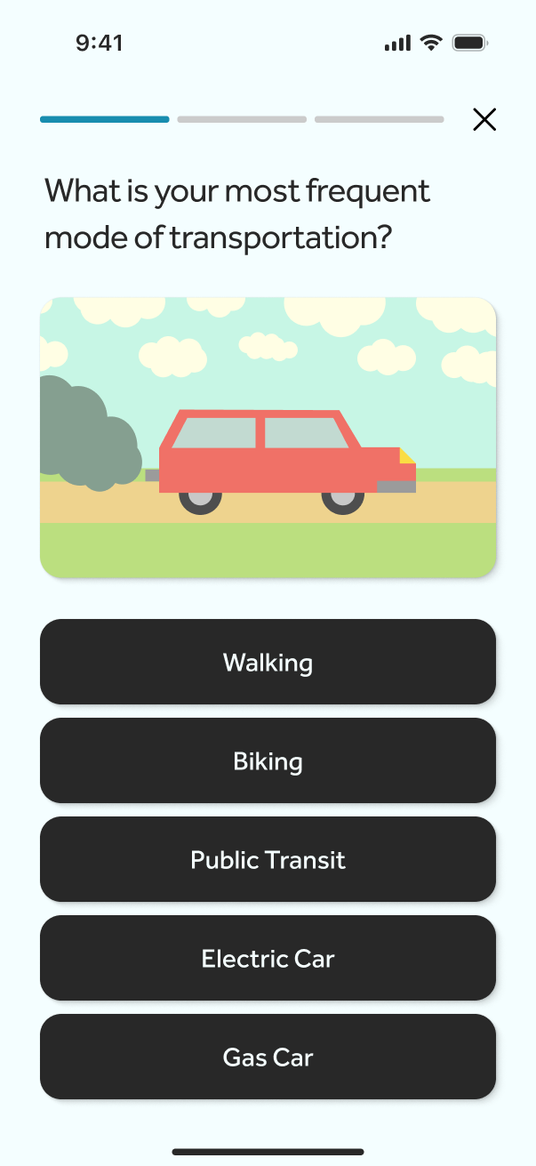
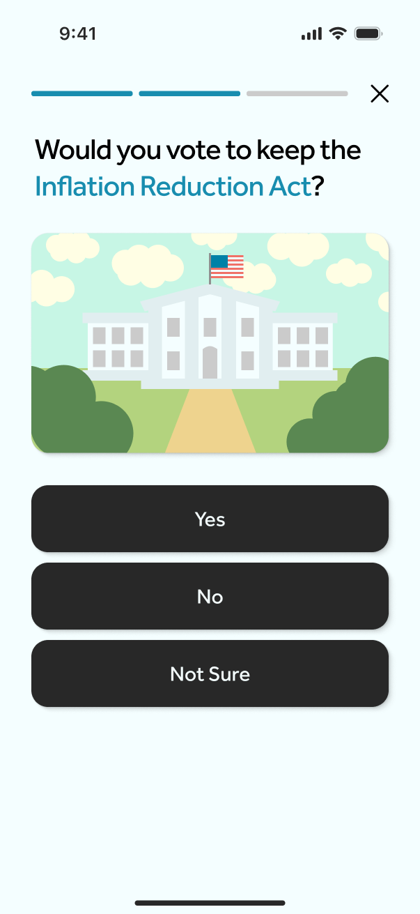
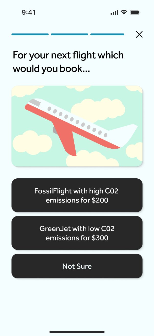
The questionnaire asks about everyday behavior, including transportation. A short sequence gives users a concrete way into the topic before introducing the wider environmental story.
Three questions
Transportation
Policy preferences
Flight choices
Feature / impact
Experience the impact
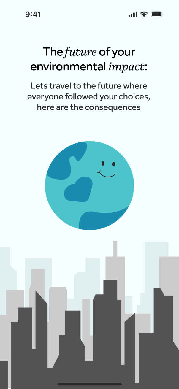
After the questionnaire, the concept introduces a visual representation of future environmental conditions. The intent is to connect the user’s responses with a more tangible way of thinking about climate change. These scenarios illustrate climate trends. They do not calculate how one person’s answers would change global conditions.
Loading the results
Results loading screen
Feature / timeline
Explore the past, present, and future
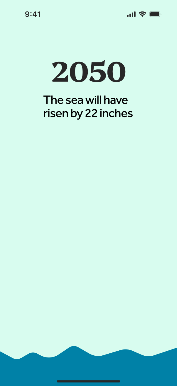
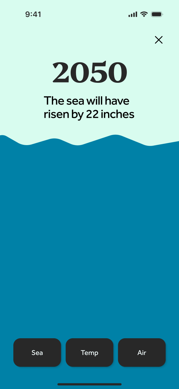
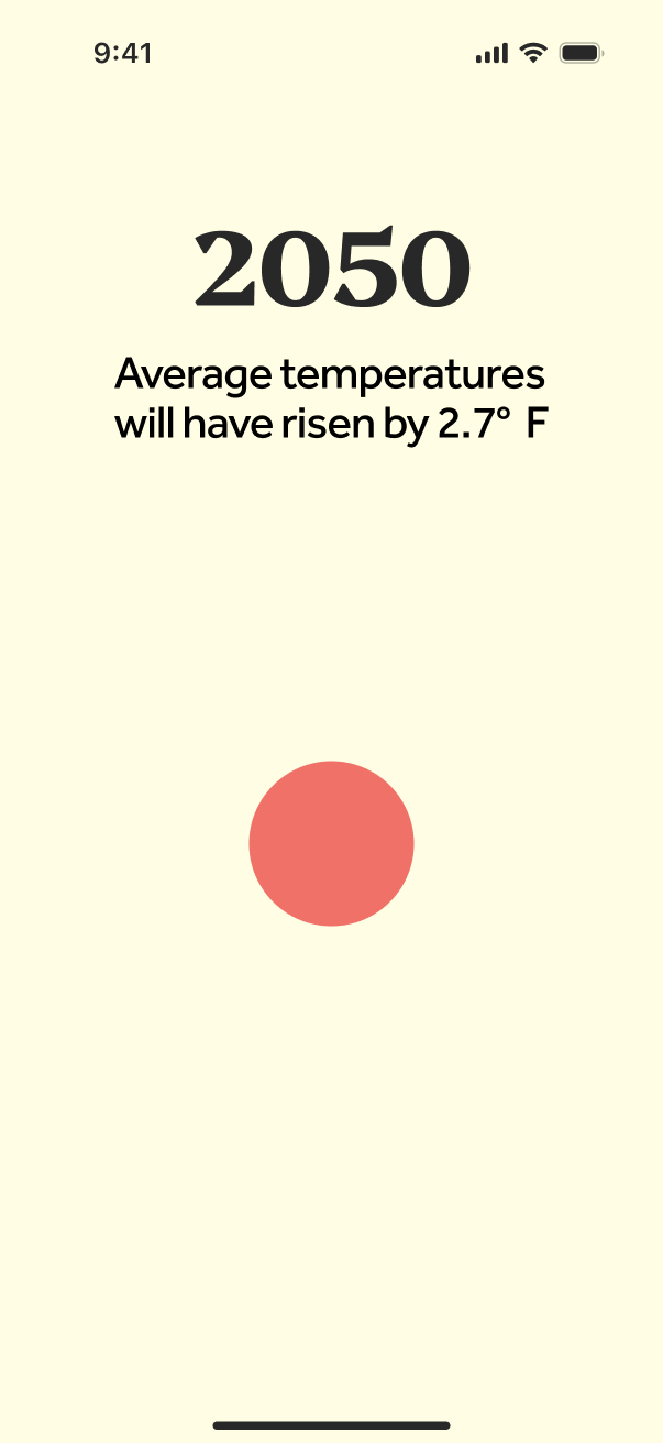
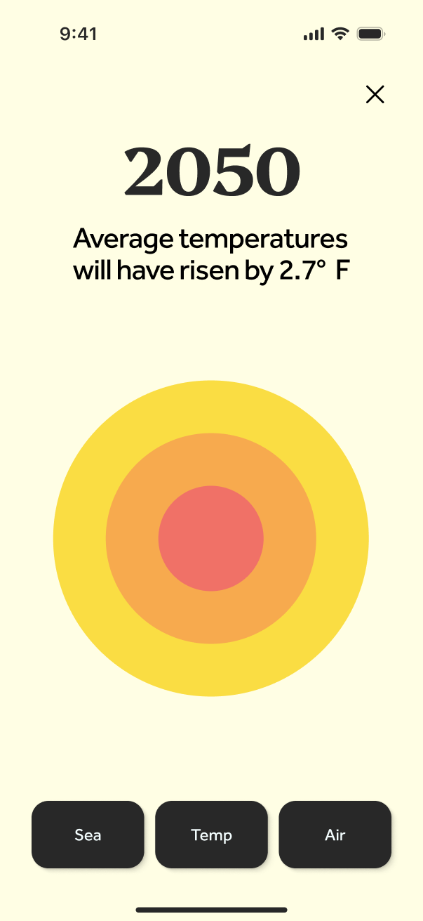
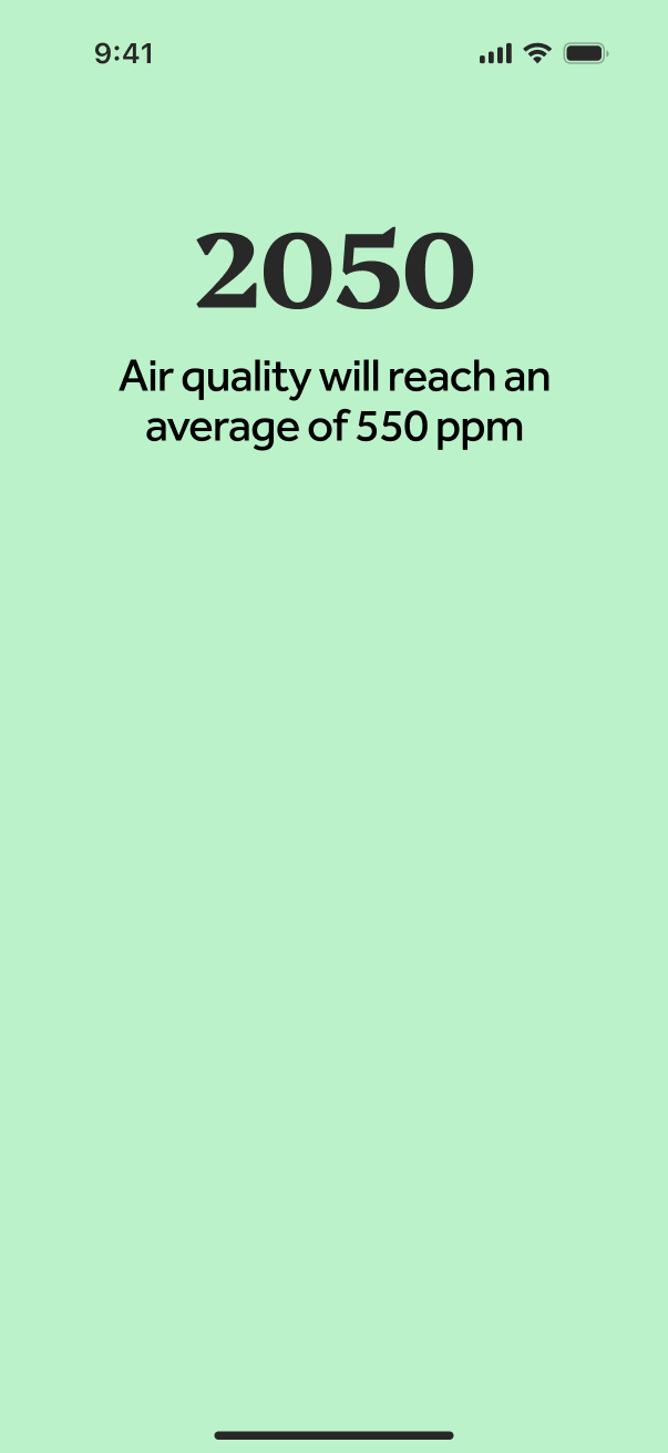
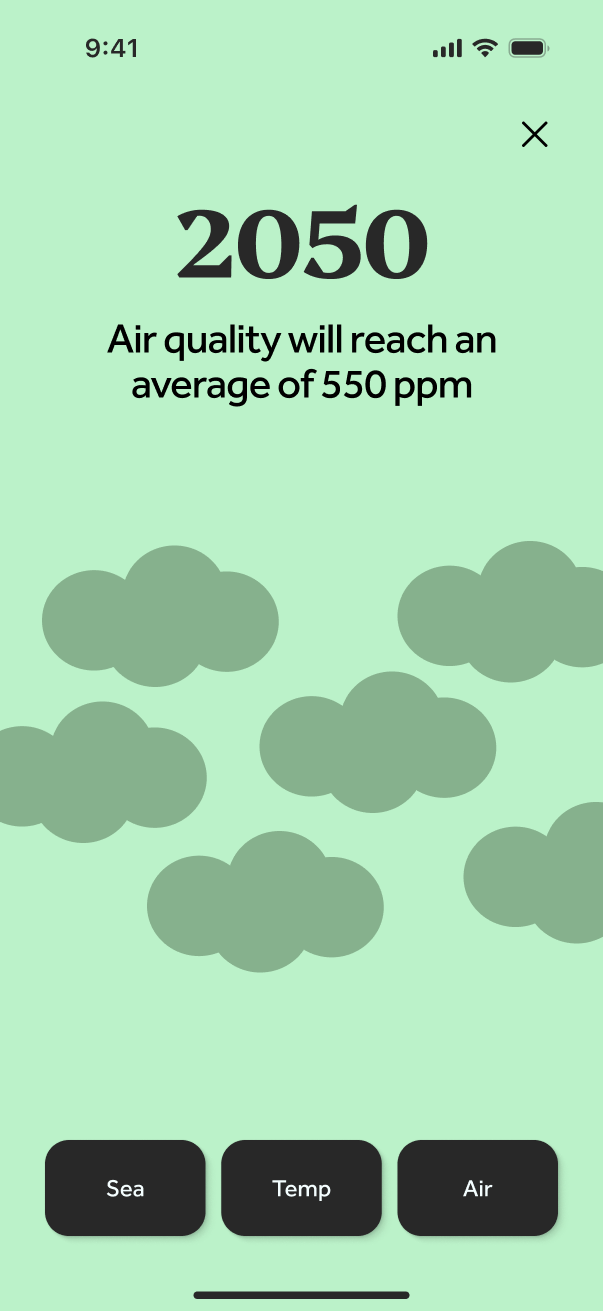
The lo-fi prototype explores movement through time with a slider. The hi-fi screens develop the visual response through initial and loaded states for sea level, temperature, and air quality, with large year labels and controls for switching topics.
Sea level
Sea level initial state
Sea level loaded state
Temperature
Temperature initial state
Temperature loaded state
Air quality
Air quality initial state
Air quality loaded state
Explore the Terragone prototype
Try the interactive prototype after reviewing the screens to see how the transitions and navigation connect the experience.
06 / Feedback
A prototype for making climate information more approachable.
The project produced a research-informed mobile concept, a persona, low-fidelity wireframes, and high-fidelity screens. Its contribution is a proposed way to connect personal reflection with visual exploration of environmental change.
The prototype still needs usability testing. Our next step would be to find out whether people understand the climate scenarios and can explain the relationship between everyday habits and environmental impact.
Questions for a next iteration
- Do people understand what their footprint estimate represents and how it is calculated?
- Can they distinguish illustrative future scenarios from predictions?
- Does moving through time improve understanding of the selected environmental metric?
- Are the visualizations understandable with accessible alternatives to color and motion?